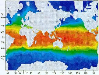
 Annual mean sea surface temperature, shown in Mercator projection |
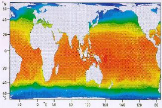 Annual mean sea surface temperature, shown in Gall-Peters projection |
The following two maps give a final comparison between the Mercator and the Gall-Peters projection.
Annual mean sea surface temperature, shown in Mercator projection |
Annual mean sea surface temperature, shown in Gall-Peters projection |
The annual mean sea surface temperature is shown through colours; red is warm, blue is cold. Which of the two maps shows a warmer ocean? Select (click on) the button which, in your view, gives the correct answer: