Unfortunately, your answer is not correct: North America (Canada and the USA, including Alaska) is about 80% of the size of Africa.
You might well be excused for your mistaken perception of the sizes of North America and Africa. One reason why people often misjudge the relative sizes of countries and continents is the widespread use of projections in situations for which they were not designed. This is particularly true for the Mercator projection.
The Mercator projection is one of the most famous and most useful map projections of the modern age. It was designed by Gerhard Cramer, who changed his surname into Latin (Mercator [Latin] = Cramer [German] = trader [English]). Cramer was born in Flanders (in present-day Belgium) and worked most of his life in Duisburg (Germany) for the German king Charles V. In 1569 he published his World Map for Seafarers, which has become the standard tool of navigation officers the world over.
The Mercator projection does not conserve area; in fact, area goes to infinity as the poles are approached. The North and South Pole can therefore not be shown in Mercator projection.
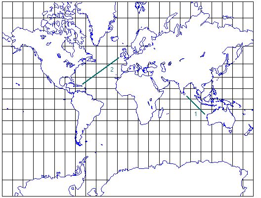
What makes the Mercator projection so useful for navigation is its fidelity of angle: The correct compass course between any two points on the surface of the earth can be read from a Mercator map as the angle of the straight line between the two points on the map: The compass course from Northwest Cape in Australia to Sri Lanka (1) is 315° (toward NW), the compass course from Ireland to Jamaica (2) is 225° (toward SW).
(Note: The direct compass course between two points does not necessarily give the shortest distance between the two points. This is beyond the topic of this exercise, but if you want to know more about this you can look up the glossary under great circle.)
This example of a Mercator world map is based on the projection page of Hans Havlicek by permission. The map you see when you click on the "map of the world" link below is another example of a Mercator world map.
Let us have another quick test. In your opinion, how does Arabia compare with Greenland. Select (click on) the button that, in your view, shows the correct answer: Greenland is ...
You have the option to look at a map of the world; but do not be misguided by what you will see!